UX CaseStudy – BuddyUp App

“I do not feel safe
 travelling alone”

DISCOVER USER PROBLEM

As part of a one week online immersive UX bootcamp course with the General Assembly, the challenge set was to explore a problem space that I was passionate about – I chose travel, my greatest love. Travelling alone can be a daunting experience especially for a female. A female traveler tends to look for somebody to accompany them or tends to join tour groups as they look for safety in numbers.

User interviews

GOAL: To get an understanding of how women feel when travelling. The challenges they face and precautions that they take when alone.

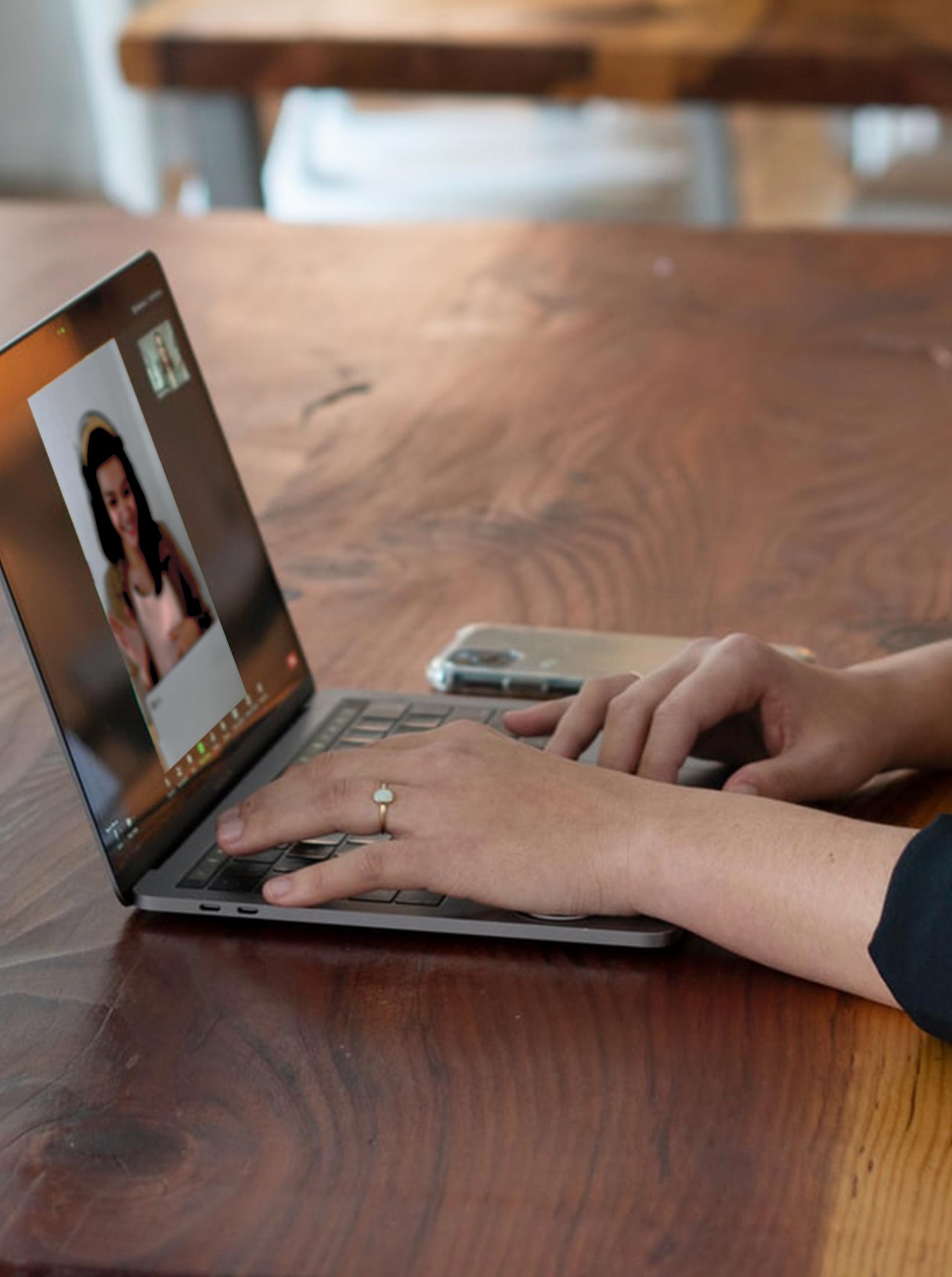
METHODOLOGY: 5 females were interviewed and their answers were recorded via Zoom.

PARTICIPANTS: They were all working professionals, who travel regularly, aged between 28 to 40

RESEARCH QUESTIONS: The following questions below were asked during the interview. To gain more insights, the user was asked to elaborate further to get to the root of their problems.

  • When was the last-time you traveled alone?
  • Was it fun/easy/challenging?
  • What challenges did you face?
  • Were they any extra precautions you took when traveling alone?
  • Please can you elaborate how you meet other traveler on your journey?
  • Are there any existing tools that you use to help when traveling?
Background

User Insight

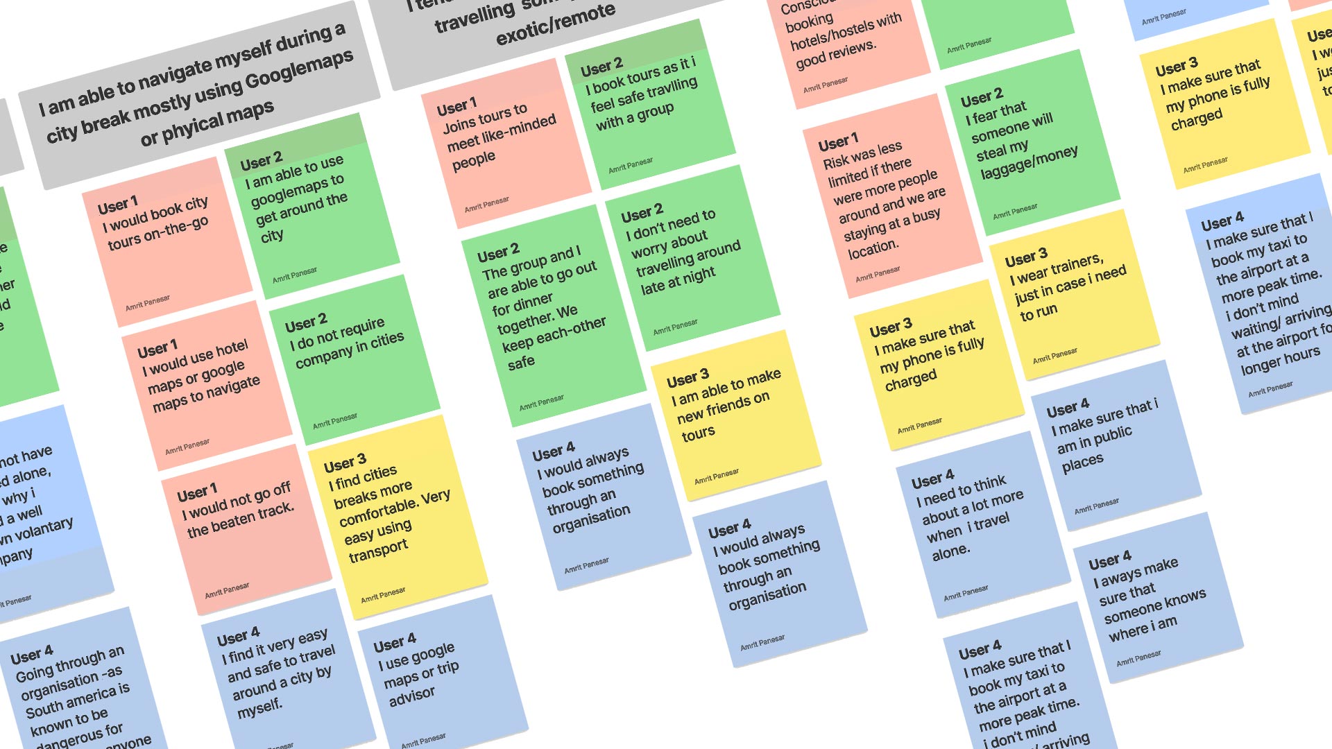
From my findings I learnt that a lot of my assumptions were correct, and it was quite heartbreaking to hear. Women in general do not wish to travel alone. They do not feel safe. They tend to book group tours as they look for safety in numbers. But find that a some of the people on these tours are too old, too young or a couple. They feel like they are missing out on fun adventures, because their friends are not always available to travel. They tend to make friends with people they meet in hostels/tours and continue to travel with them to other places. But in general they find it difficult finding company of women with similar interests. They are happy to travel alone in cities & crowded places. Google maps and Trip advisor play a key part in their solo travel. They tend to take extra precautions such as wearing comfortable “running” shoes, as well as carrying alarms and defence sprays.

“Some countries are known to be dangerous for females. So I tend to book group tours. But the women tend to be a lot older. Main thing is Safety in numbers as they say”

“I would only turn to other female travellers, 
if I require help”

“I was able to attend events late at night with the company of other females that I met in a hostel. I would not have gone alone.”

“My friends are not always available to travel, and I feel like I’m missing out on exploring the world. 
But I would never go alone.”

Problem Statement

“I do not feel safe
 travelling alone”

Females who have a passion for travelling need a tool to help find the company of other like-minded females because they need to feel safe on their holidays. They do not want to miss out on fun adventures. They do not want to travel alone.

How might we…

  • Help like-minded females to connect on the go using maps/chat feature, as well as connecting for any future travel plans.
  • Provide emergency contact info – find nearest police station or embassy or tourist bureau / SOS information in need of help
  • Activate an alarm on your phone
  • Offer reviews / star rating from the users to show tips on places to visit / avoid / restaurants / hotels.
  • Offer tips on hotspots to avoid, on a map for their safety
  • Help find suitable tours, that meet 
their budget / demographic.

Personas

After analysing the data from the interviews, 2 personas emerged.

Primary

ABOUT
Jasmine, a 37 year old, freelance Landscape architect who lives alone in Kent. With a BA degree in her chosen profession, Jasmine can earn up-to 50k per annum.

BEHAVIOURS
Jasmine enjoys group tours as she feels safe with the company of others. She uses TripAdvisor for everything from finding best tourist places to visit, best hotels and best places to eat. She conducts research about a country before she travels using lonely planet website or books. She finds TripAdvisor map feature a helpful resource when traveling on the go in a city.

FRUSTRATIONS
A lot of her friends are married with children so her traveling days with them are over. She is unable to meet people of her age who do not need to travel on a budget. But needs to join a tour group for safety reasons. The people on these tours tend to be a lot older than her. She finds it frustrating that she has to pay full price for hotel rooms / tours being a solo traveler.

Secondary

ABOUT
Lilly is a 29 year old mid-weight digital designer working for a design agency. She is currently renting an apartment with her friend in London. Having a BSc degree in multimedia, Lilly is very skilled in her profession and earns 34K per annum.

BEHAVIOURS
Her favourite apps include google maps, Uber and her Deliveroo. She loves instagram and finds this as a great source of inspiration for holidays. She find it easy to travel by herself in cities and uses trip-advisor for reviews.  For more remote/exotic travelling, she tends to join budget group tours.

FRUSTRATIONS
She would like to travel further out to more exotic places, but does not wish to travel alone. She finds it frustrating that her friends/families are not always available to accompany her.  She feels that sometimes she misses out on opportunities to explore places.

Feature prioritising (MVP)

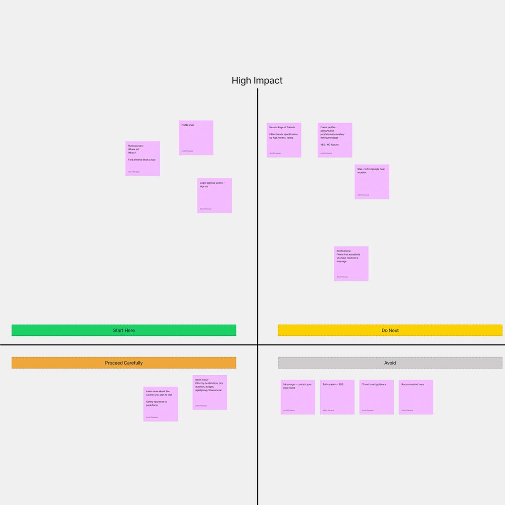
The main feature for this app should be connecting like-minded solo female travellers before travel and on the go. There were a lot of features that could be potentially added to this app on a later date such as “join a tour” or reviews for recommended tours, places to visit, best places to eat and top safety tips. But the primary focus will be a home screen that gives the user a choice to connect with other female travellers by date/country of by current location.

Competitive analysis

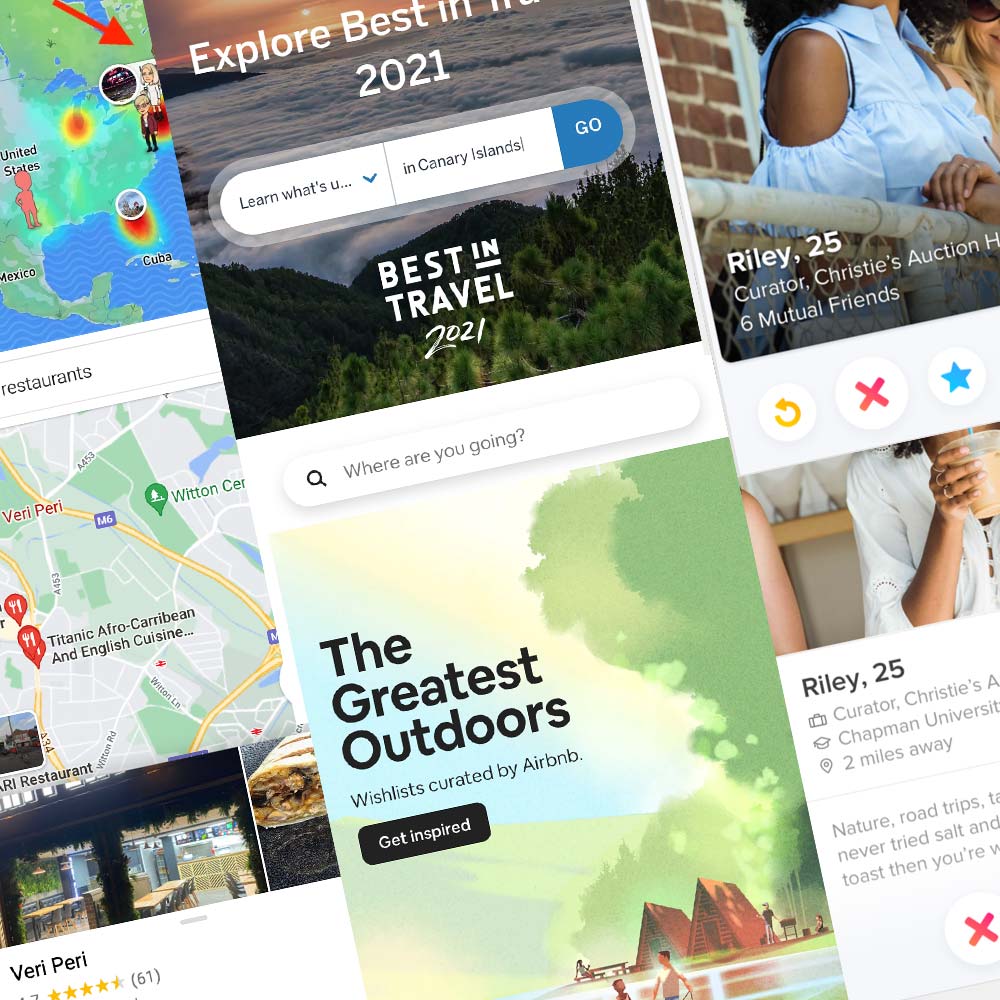
The sites that work well are those that have a minimalist look and feel such as Airbnb. Simple navigation with clear actions and auto fill forms make the user experience easy to use and explore. The quick location and date input feature brings instant results. As this is the main user information required, it appears at the top of the site.

When adding a map tool, no-one does it better than google maps. The top search easily serves up details on points of interest, such as restaurants and reviews. Simple card features allow the users to explore more information.

SnapChat includes a “find my friend” feature on their platform using small fun avatars, linked to friends current location on a map.

Tinder was a source of inspiration as it includes the popular “Yes”, “No” swipe next feature. This feature could potentially work well on my app for users to pick and choose new friends.

Direct competition

After more intensive competitor analysis, two apps in particular were investigated as they included very similar ideas.

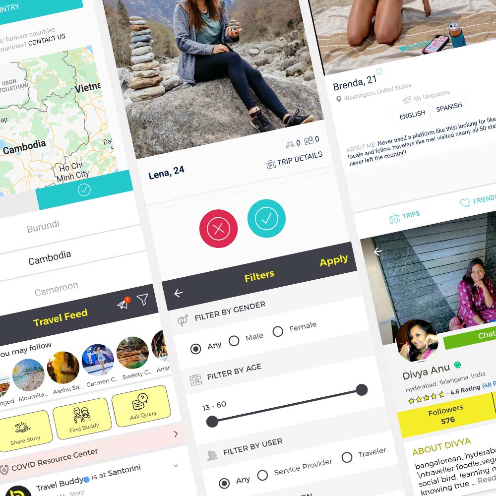
Tourlina
A female only app, where “women can find interesting and entertaining female travel companions and locals within a secure and trusted network”. Toulina allows females to connect with others using the YES ✅ / NO ❌ / SWIPE feature used currently for Tinder. Although this is a familiar feature, the overall style looked more like a dating app than one to find friends. It was also quite difficult selecting a country for travel. The countries on the world map were not clickable – but a small scrollable window appeared listing 70+ countries that the user has to scroll through to select the one applicable.

Travelbuddy
This apps uses very similar UX/UI features to Facebook. It is more of a social network, where users can post photos/stories/videos on their timelines. Users can meet local travellers from current location, “chat with them to know the place, & plan unique trips”. If planning a future trip, “you have friends waiting on this community with guidance and suggestion”.

User flow

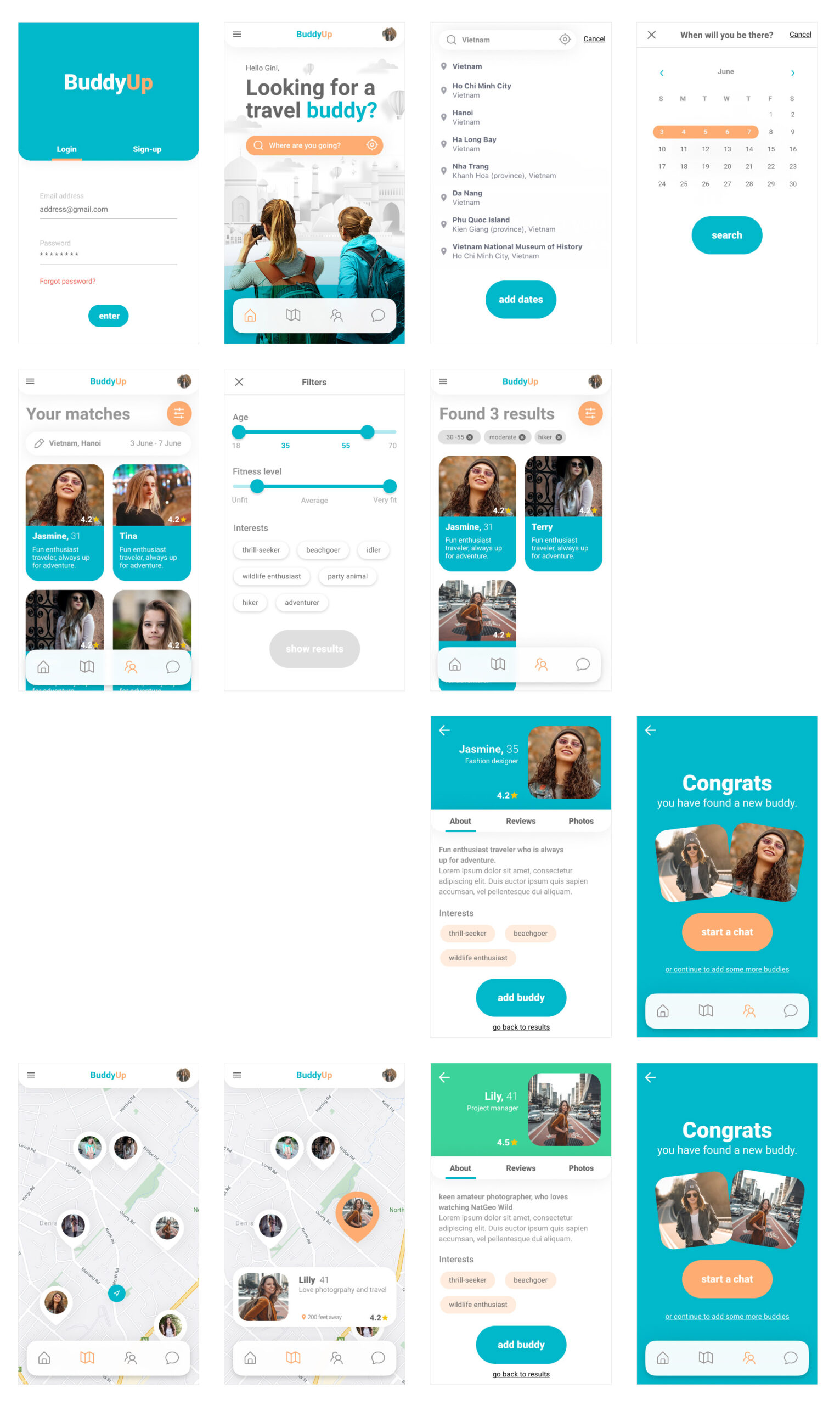
As discussed earlier, the main feature for this app will be connecting like-minded females by future travel plans or by current location. Starting with the SIGN UP / SIGN IN page, this will ensure that all users are verified before using the app.

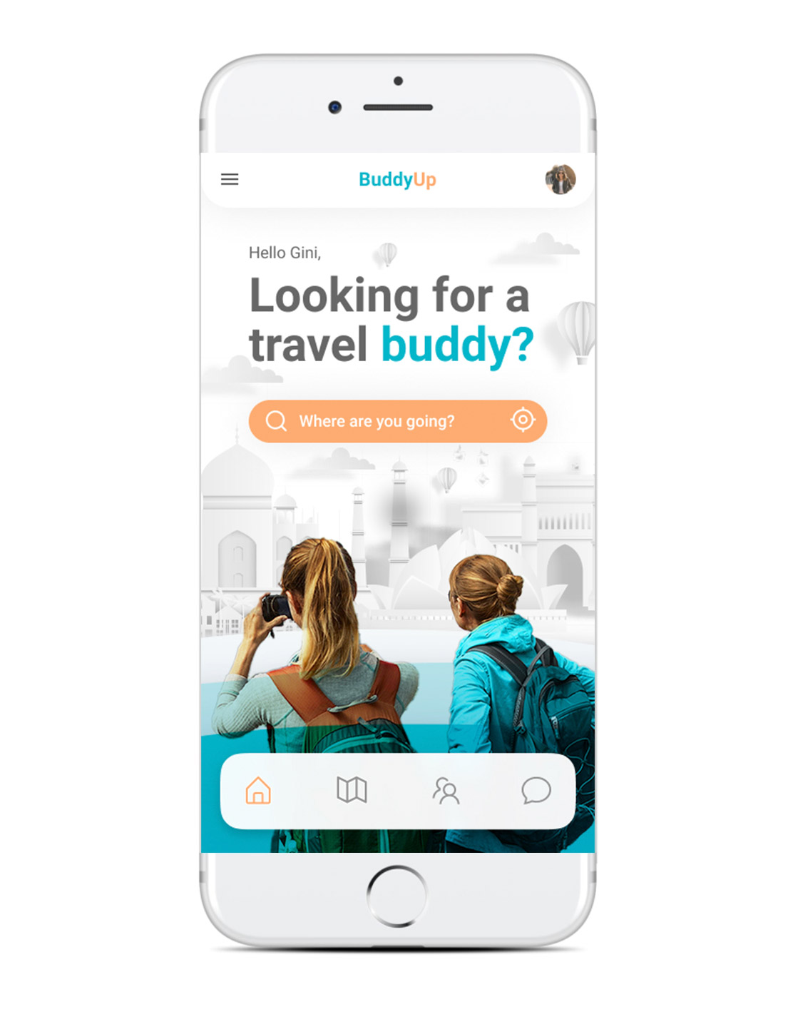
This is then followed by the home screen with an input text field search box, asking the user to either find a travel friend by country or by current location. If the user chooses current location, this will lead to a map showing traveller profiles nearby. The user is able to click and read information about this friend and then add them to their list of contacts.

If the user wants to search by country, they will need to input the country/city name and autocomplete suggestions are listed. Once the country & city have been selected, this leads to dates of travel input field.  Once the user hits SEARCH, the search lists potential matched profiles. The user is able to select friends that they would like to connect and contact them through a messenger feature. 

Background

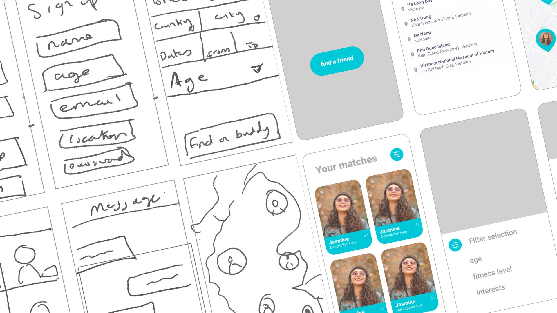
Low Fidelity Designs

Usability Testing

The importance of usability testing enabled to iron out any issues the user found confusing or got stuck completing an action. The data collected helped to improve the overall design/function for the app.

Date input feature

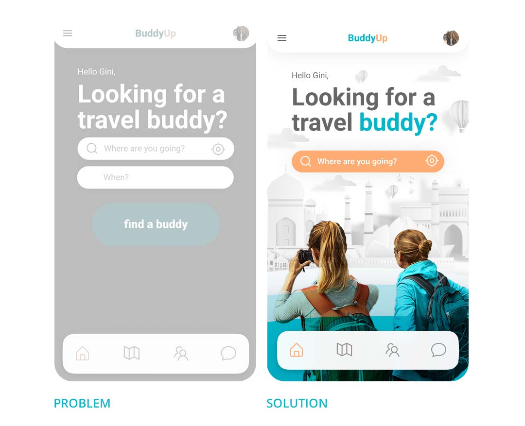
PROBLEM: When set the task to enter ‘search for profiles by country and date’, multiple users would try to input DATE (‘When?’) or click on the prominent button ‘Find a buddy’. This would cause an error. Without inputing the main data field of COUNTRY, “Where are you going?” the next steps become redundant.

SOLUTION: By removing the DATE input field and button “find a buddy”, users were able to complete the task without other distractions and errors.

Filter profile

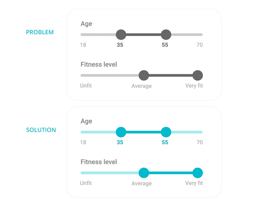
PROBLEM: When set the task to filter the profile search for more accurate results, users were unable to detect whether the slider buttons were draggable or not.

SOLUTION: The easiest solution was to add shadows under the roundel buttons. This made it obvious that the buttons can slide across.

Profile thumbnail

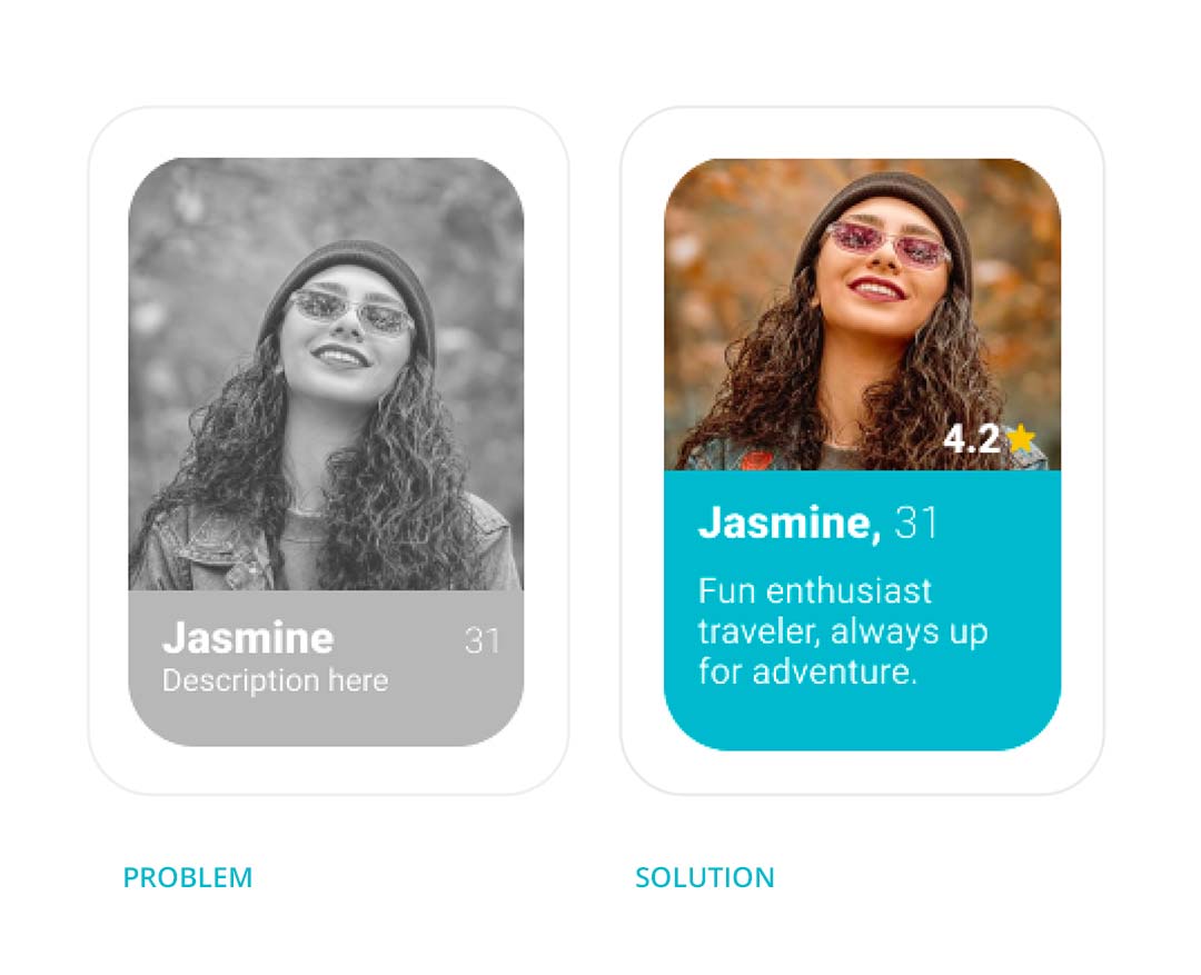
PROBLEM: Some users thought that the aesthetics of the profile thumbnails looked more like a ‘dating app’ rather than of one trying to make new friends by interests.

SOLUTION: The simple solution to this was to decrease the size of the photo and add more of a description text about the person – since this app is more about connecting people with similar interests than appearance.

Connect with a profile

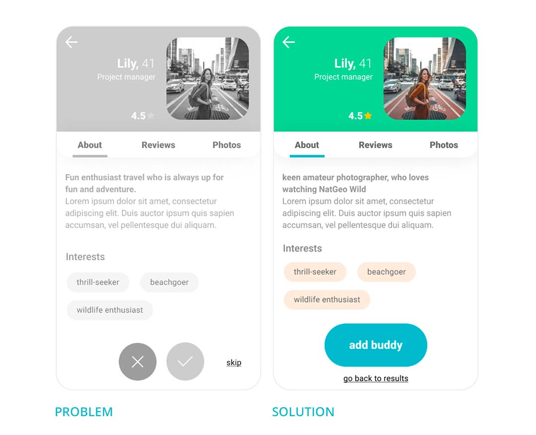
PROBLEM: This was the most difficult task for the user to complete as they expected to go back to the “search results” if they did not want to connect with a profile. Using the Tinder feature of YES ✅ / NO ❌ / SWIPE, multiple users suggested that there were too many choices given to the user and that the this feature should be a lot more simplified.

SOLUTION: Removing the YES ✅ / NO ❌ / SWIPE, users were given a simpler option of choosing between a more prominent CTA “Add buddy” or a sub CTA “go back to search”. And with the amendments made to the profile thumbnail, there was enough information for the user to read about the profile before clicking.

Background

High Fidelity Designs

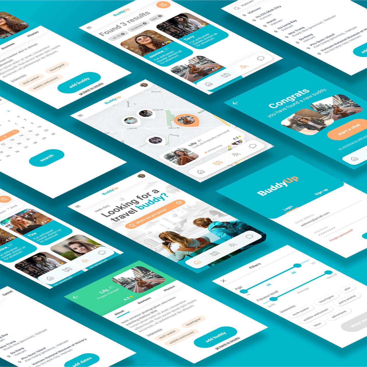
Based on the usability test results, certain features had to be revised to be made more simpler. By offering this interactive app, BUDDY UP can easily help solo female travellers connect with others by future travel plans or on the go.

Final Prototype

The software Figma was used to design and create this prototype, along with Adobe Photoshop and Illustrator.

Next Steps

For next steps it’s important to consider some points made by the users regarding filtering by “profile ratings”. This could have a negative impact on all verified users and their self confidence of being rated using stars.

As this was more of an UX case study exercise, it would be great to revisit the overall branding of the app and give it more of an identity as well as a better logo design. Not to mention considering other features such as ‘book a tour’ or ‘share the cost with your buddies’ similar to Monzo. These new iterations will all lead to more user testing.

Overall BUDDY UP received some amazing feedback about the design and features. Users “love the layout”, especially the “simplicity of the interface” and “cleanliness of design”. Some found the navigation to be very intuitive, particularly for anyone who has used dating apps and travel sites”. There was also a suggestion of creating something similar for male travellers. Others considered this to be a very important and useful app.