Renault Twingo: Responsive Site Design

Renault partnered up with Look, Instyle and NME editors – To Raise awareness and familiarity of Twingo through different activations supporting Twingo’s personality. Seen as a fun car aimed at young women, it’s considered to be a practical car that will fit into there lifestyle.

“The Renault TWINGO is the ultimate small city car, with bags of personality and design innovations that make it extremely suited to everyday life, so what better way to celebrate this than with the ultimate city test drive followed by an exclusive event.” James Boyer, Marketing Director, Renault UK

As well as raising awareness, one of the main KPI’s was to get users to enter a competition to win tickets to a secret gig partnered with music streaming service Spotify. The winners were driven to the secret event in London. 

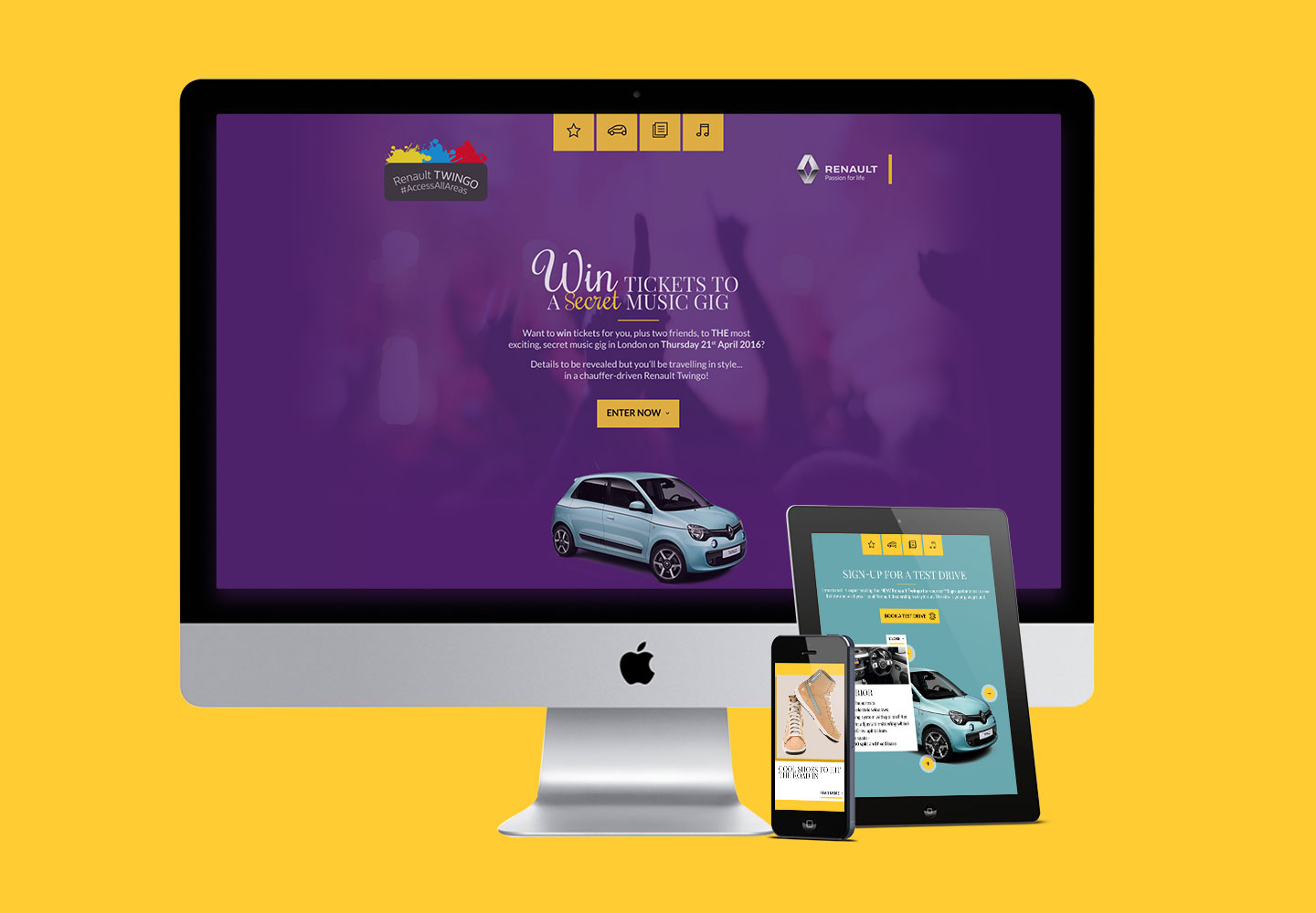
A responsive hub was designed to feature loads of editorial content, but most importantly focusing on the secret gig as well as getting users to book a test drive.
Background

UX

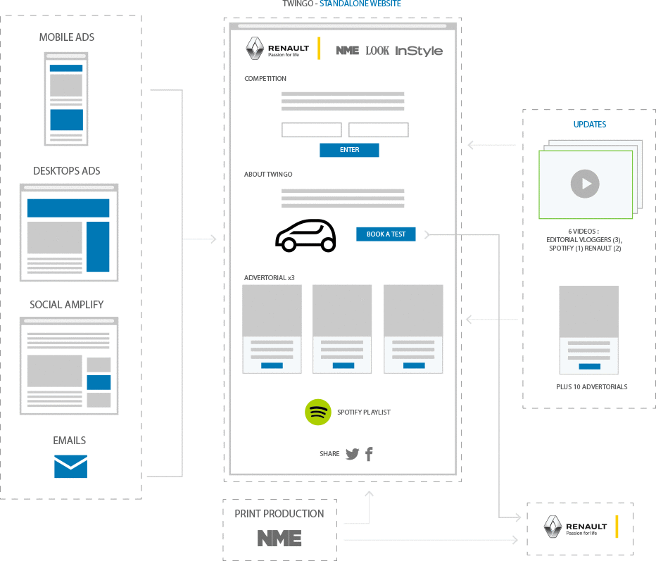
The diagram (below) illustrates the overall user journey – including  social media, Traffic and Print production driving to the site, as well as the updates required.

Background

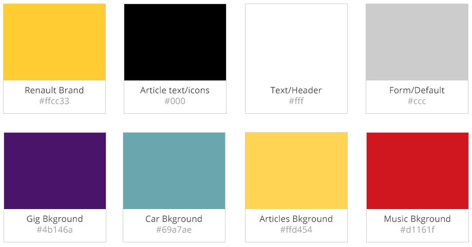
COLOUR

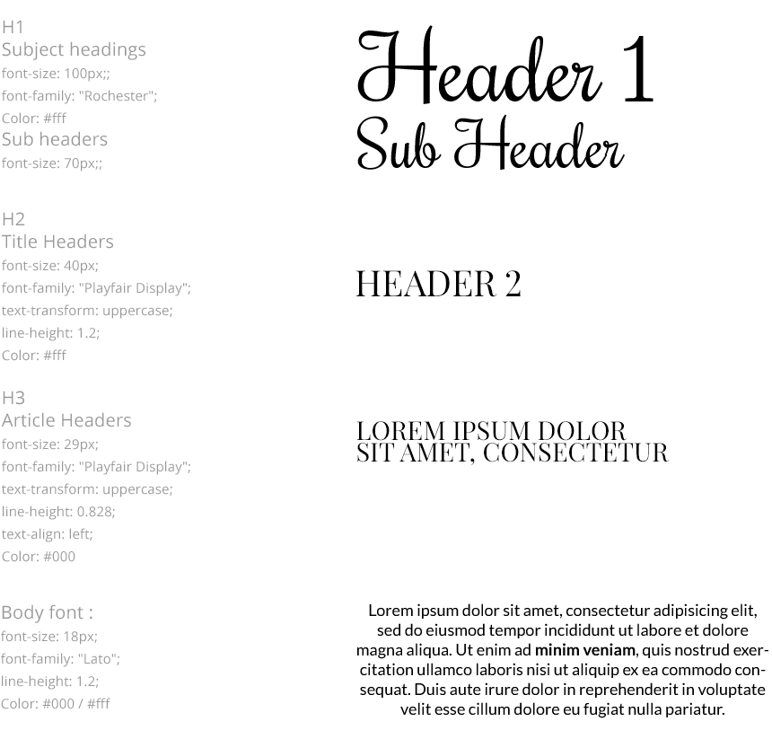
TYPOGRAPHY

NAVIGATION

ICONGRAPHY

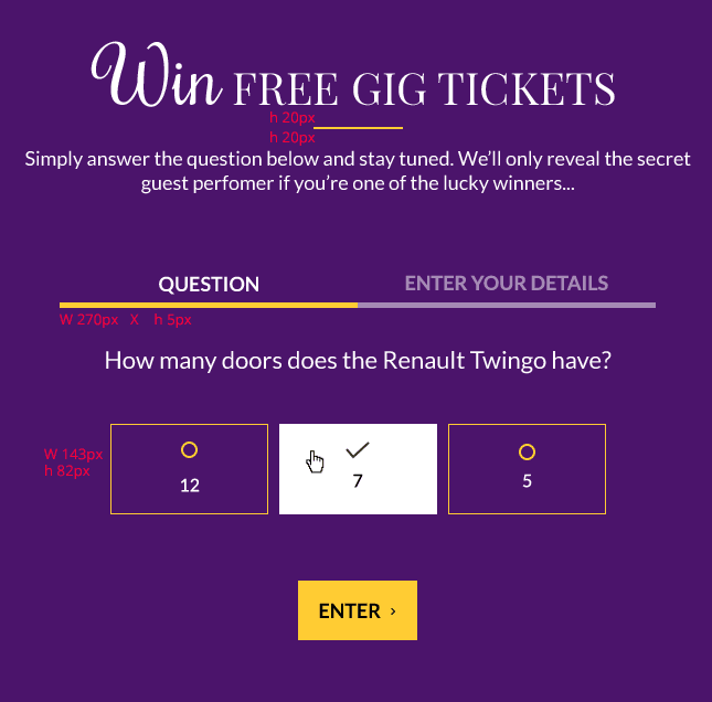
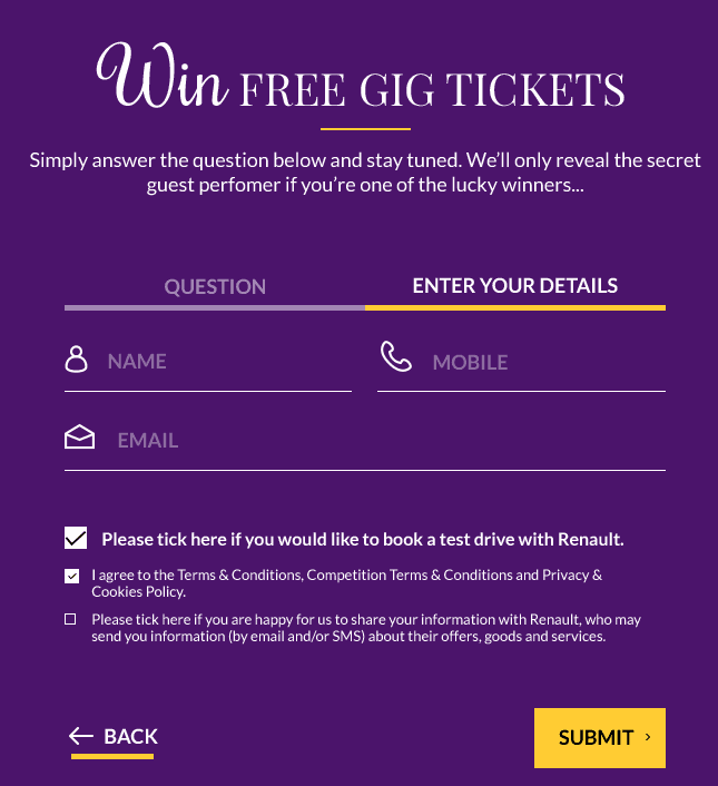
COMPETITION FORM

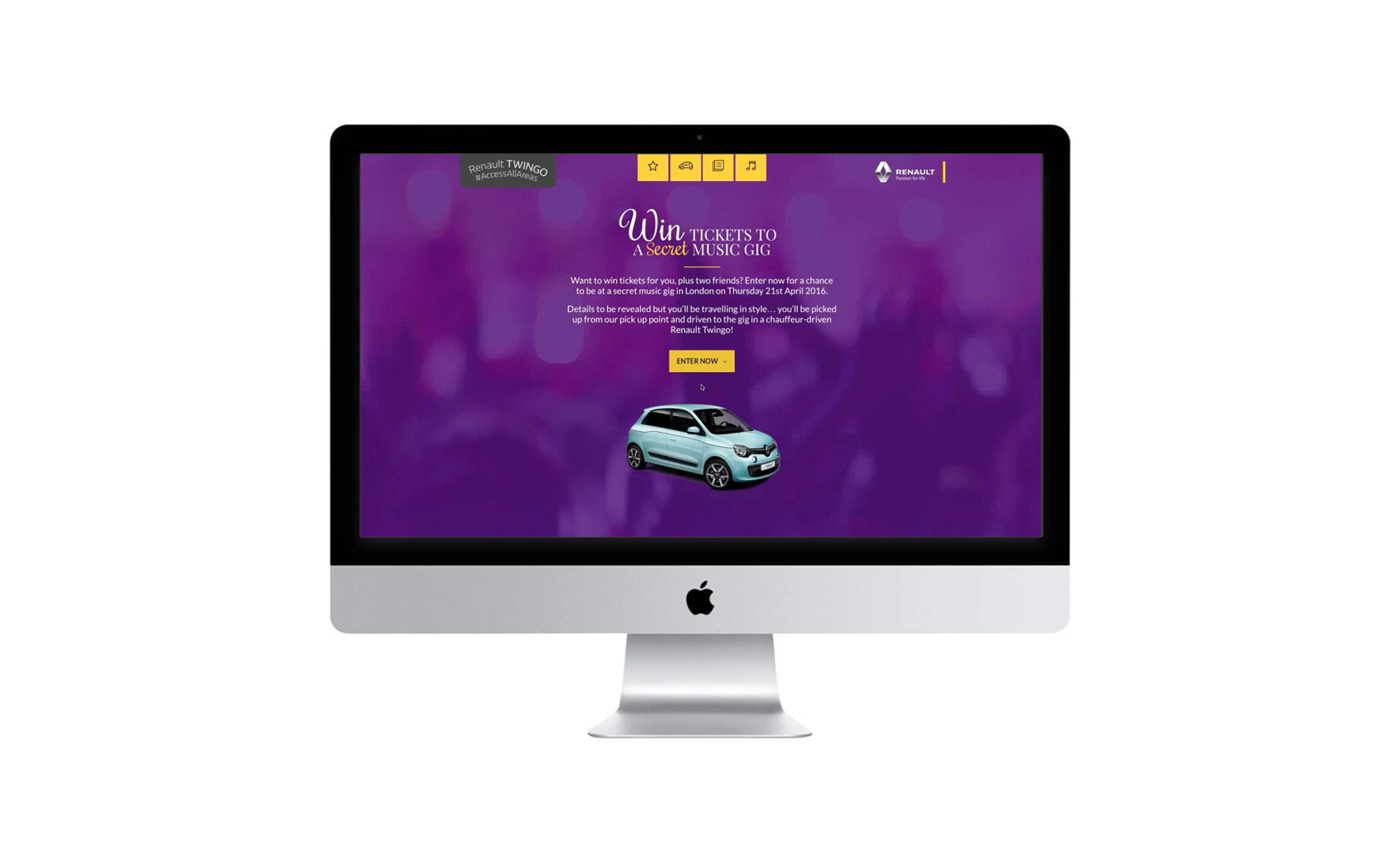
DESKTOP

The final build consists of many interactive elements. The main KPI was to get as many users as possible to enter the competition. The second KPI was to get users to ‘Book a test drive’. To make this as interactive as possible for the user, small subtle animations were used for rollovers when interacting with the form and car elements. Also, to add a bit of ‘excitement’ about the gig, a background video was placed. This was created within After Effects which allowed the video to be looped as well as colourised.

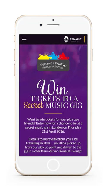
MOBILE

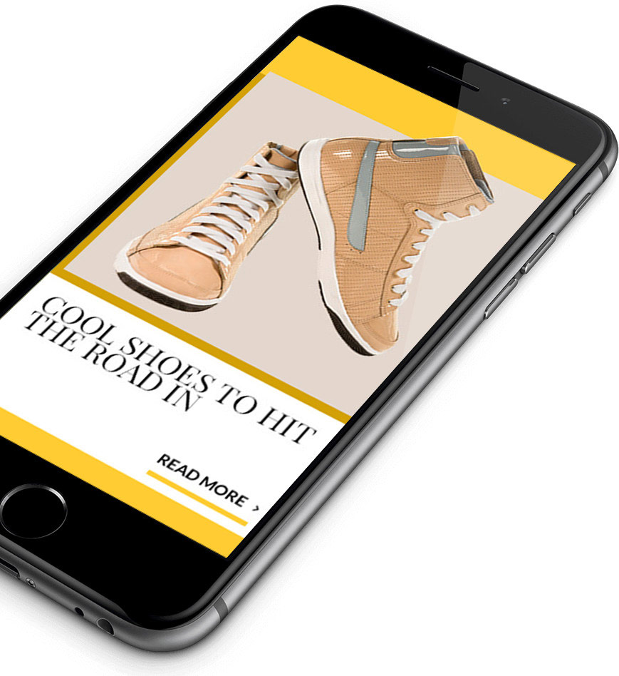
When creating this design, it was equally important if not more, to make sure the mobile design/build works just as good as on the desktop. Extra features such as ‘swipe’ were added for the content section. As well as a nav bar that opens to reveal the same icons/menu buttons used for the desktop version.


FINAL DESIGN

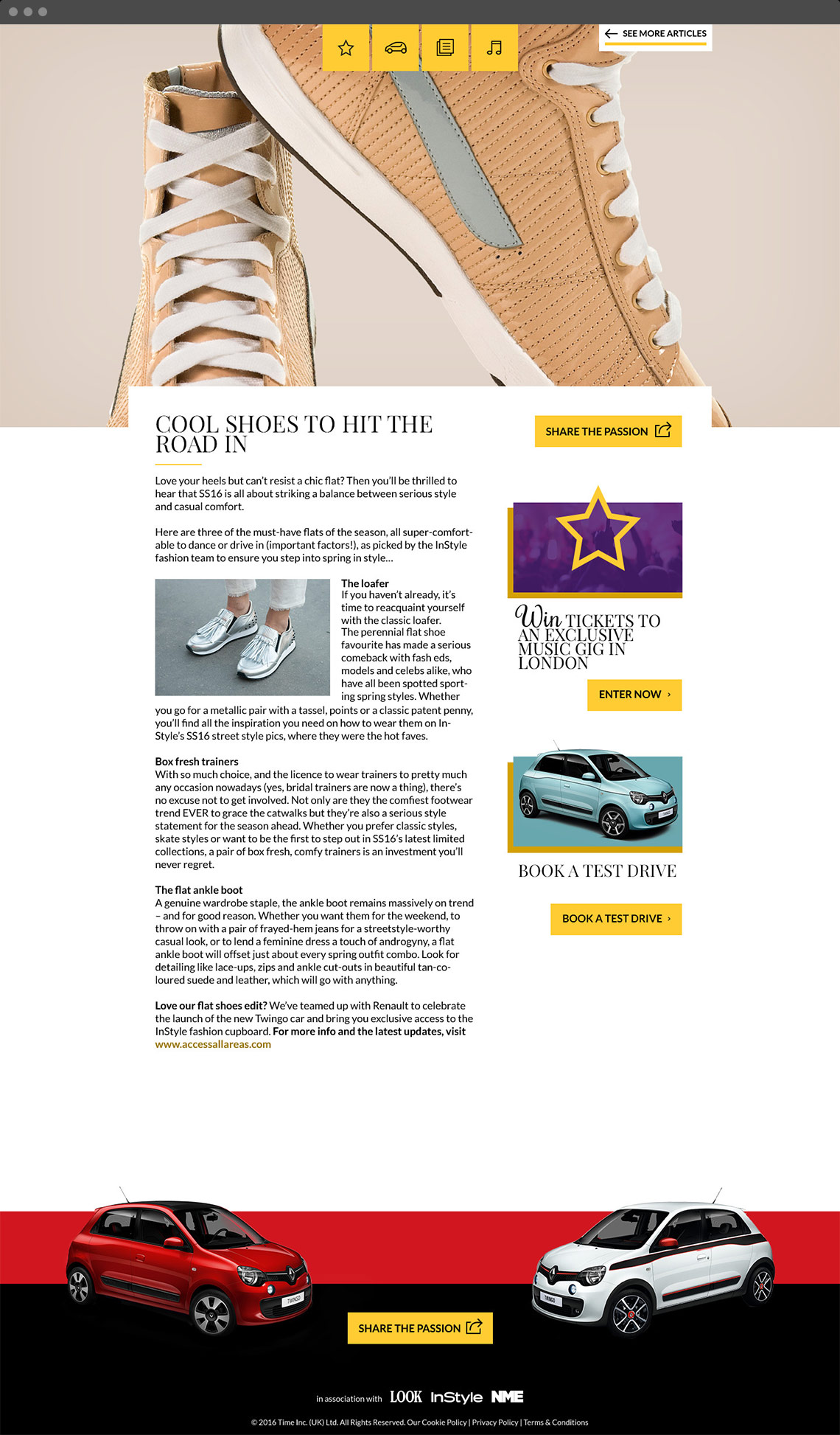
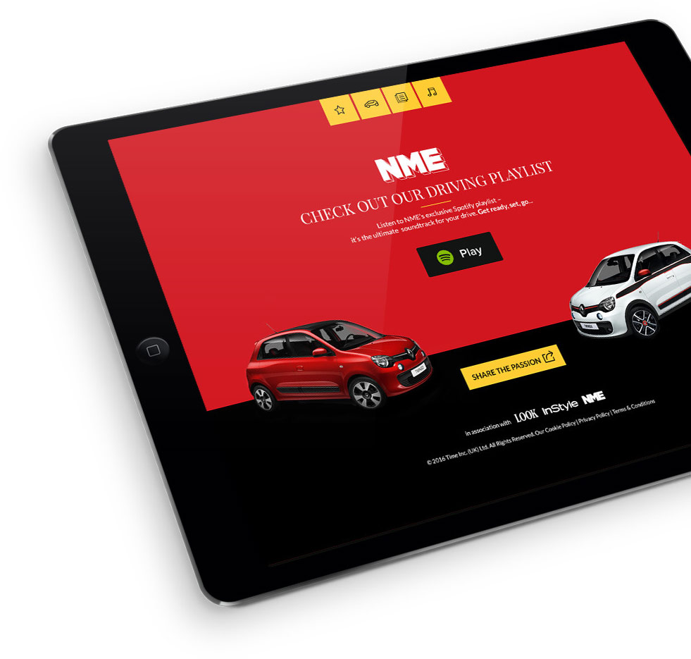
The hub was designed in a way so that content can be easily added and updated regularly over the 6 months. A desktop, Ipad and mobile hub version were designed within Adobe Photoshop – including an article page.